
Building a Component Library That Actually Works
A practical guide to organizing components, creating variants, and documenting them so your team actually uses the system instead of ignoring it.
Why Most Component Libraries Fail
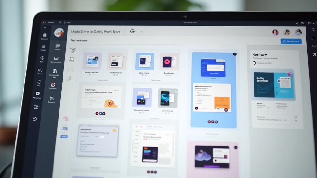
You’ve probably seen it happen. A design team builds a beautiful component library in Figma. It’s got buttons, forms, cards, modals — everything organized perfectly. Then three months later, designers are creating their own custom buttons because they can’t find what they need. Or worse, they find components but don’t understand how to use them.
The problem isn’t the components themselves. It’s the documentation, naming conventions, and variant structure. A component library that doesn’t communicate clearly becomes dead weight nobody touches. We’re going to fix that.
What You’ll Learn
- How to structure components so they’re easy to find
- Creating variants that cover real use cases
- Documentation that designers actually read
- Team collaboration practices that work
- Maintaining your library as it grows
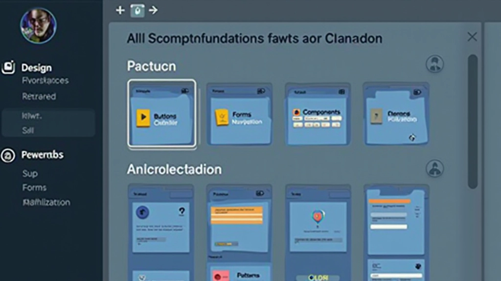
01. Folder Structure That Makes Sense
The first thing your team sees is the folder hierarchy. If it’s chaotic, they’ll give up before exploring deeper. We’ve tested dozens of structures. The one that works best mirrors how designers actually think about components.
Start with broad categories: Foundations, Components, Patterns. Under Components, group by function — not by visual style. Buttons go together. Forms go together. Navigation elements go together. Don’t separate “Primary Button” from “Secondary Button” into different folders. Keep them together and use variants instead.
Within each component folder, name files consistently. “Button / Base” and “Button / Icon Button” work better than “btn-primary” or “action-button-v2”. The naming tells you what the component is and what variant you’re looking at.
02. Variant Strategy That Covers Reality
This is where most libraries go wrong. People create variants for everything — 47 different button combinations that nobody uses. Then when a designer needs something slightly different, they can’t find it and make a custom version.
Instead, focus on variants that solve actual problems. For a button, you need Size (Small, Medium, Large), State (Default, Hover, Active, Disabled), and Style (Primary, Secondary, Tertiary). That’s it. Three variant groups. Nine combinations total. Every designer knows how to use it because it matches how they think about buttons.
Don’t create variants for every possible color or icon combination. Create a system flexible enough that designers can swap content easily. A button variant isn’t “Button with Icon on Left” — it’s just a button that can contain an icon. The designer puts the icon in.
03. Documentation That Designers Read
Here’s what doesn’t work: a 30-page design system PDF that sits in Slack and nobody reads. Or a component page with 10 paragraphs of technical specs. Designers skip that. They want to know: What is this? When do I use it? What are the rules?
Keep documentation in Figma. Use a dedicated Design Guidelines file that lives alongside your components. For each component, create a simple page with: What it is (2-3 sentences), When to use it (quick bullets), Rules (do’s and don’ts), and Anatomy (if relevant). That’s it. Specific, scannable, actionable.
Use Figma’s annotation features. Annotate your components directly with usage rules. When someone opens a button variant, they see immediately why this size exists and what content it holds. It’s right there. No hunting through documentation.
Documentation Template
What: “A clickable element that triggers an action or navigates the user.”
When: Use for primary actions (Save, Submit), secondary actions (Cancel, Edit), or navigation.
Rules: Always has a clear label. Don’t use more than 2 primary buttons per section. Keep labels short.
Don’t: Use for navigation to other pages (use links instead). Don’t disable buttons without clear reason.

04. Keeping It Current and Usable
A component library isn’t a one-time project. It’s a living system that needs maintenance. Without governance, it becomes bloated. You’ll end up with 12 button variations that all do the same thing.
Set a simple rule: Every component needs an owner. Someone on the team who understands it, documents it, and maintains it. This person reviews new variants before they’re added. They answer questions about how to use the component. They don’t have to be full-time — but there’s a clear owner.
Schedule quarterly audits. Look at your library. Find components nobody uses. Remove them or redesign them. Find variants that duplicate functionality. Merge them. A clean library with 20 essential components beats a bloated library with 100 variants nobody understands.
05. Making Your Team Actually Use It
The most important part: getting your team to use the library. Even a perfect system fails if designers don’t trust it or don’t know about it. You need a culture shift.
First, make components easy to discover. Create a shared Figma file that’s everyone’s first stop. When someone starts a new project, they duplicate a template that includes your component library. It’s already there. No hunting.
Second, share wins. When a designer uses the library well and it saves time or improves consistency, tell the team. Show how the library sped up the design process. Build momentum. Third, be open to feedback. When someone can’t find a component or doesn’t understand a variant, that’s valuable information. Update the library based on real use.
“A component library that’s perfect but nobody uses is just a design exercise. One that’s 80% complete but your whole team trusts is actually valuable.”
— From our design team’s experience
Tools That Help
You don’t need fancy external tools to manage a solid component library. Figma’s built-in features are surprisingly powerful. But a few tools complement the process well.
Figma Libraries
The native system for shared components. Use this. It’s free and built into Figma. Version control is automatic. Your team always has the latest.
Figma Design System Tokens
Coming to Figma soon, but you can use third-party tools like Tokens Studio now. Manages colors, typography, spacing systematically across components.
Component Audit Tools
Tools like Component Tracker show you which components are used, which are orphaned, and where duplicates exist. Helps with quarterly cleanup.
Slack Integration
Figma Slack integration lets you share component links directly in chat. Makes components visible and accessible to your team throughout the day.
Building Systems That Stick
A component library that works isn’t complicated. It’s clear. Your folder structure makes sense. Your variants solve real problems. Your documentation is short and useful. You maintain it regularly. And your team trusts it because it’s reliable.
Start with the basics. Don’t try to build the perfect system on day one. Build a useful system. Then improve it based on how your team actually uses it. That’s when it becomes truly powerful — not as a design exercise, but as a tool that speeds up your work every single day.


About This Guide
This article is an educational resource based on practical design workflows and industry practices. The approaches, tools, and strategies described are recommendations from our experience with Figma workflows in Malaysia and beyond. Your specific implementation will depend on your team’s size, design maturity, and project requirements. Always adapt these practices to fit your unique circumstances. The tools and features mentioned were current as of March 2026 and may have changed.