Design Systems
Creating a Design System Your Team Will Actually Use
The difference between a design system that collects dust and one that gets used every day. Includes practical tips from teams doing this successfully.
Why Most Design Systems Fail
You’ve probably seen it before. A beautiful, comprehensive design system gets built. Documentation is perfect. Components are pixel-perfect. Everyone celebrates at launch.
Three months later? It’s sitting in a Figma file that nobody actually uses. Designers are creating one-off designs instead of following the system. Developers are confused about which components to use. And the whole thing feels like a wasted effort.
Here’s the thing — it’s not the design system that failed. It’s the adoption strategy. A design system isn’t just a collection of components. It’s a workflow. It’s a conversation between design and development. It’s something your team needs to actually want to use.

Start With the Real Problem
Before you build anything, you need to understand why your team struggles with consistency. Is it because they don’t know the system exists? Because they don’t understand how to use it? Because it doesn’t solve their actual problems?
Talk to your designers. Ask them what frustrates them. Talk to your developers. Find out what makes their job harder. You’ll probably discover that the system you think you need isn’t the system they actually need.
In Figma, this means starting with a team audit. What components do people already create repeatedly? What design decisions get made over and over? That’s where your system should start — with the patterns that already exist. You’re not inventing something new. You’re organizing what’s already there.
- Interview 4-6 team members from different roles
- Document the patterns you see repeated
- Identify pain points in current workflows
- Build around what people actually need

Build It in Layers
Don’t try to build everything at once. That’s where most teams get stuck. Instead, build in layers.
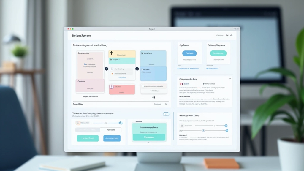
Start with foundations — colors, typography, spacing. These are the building blocks. In Figma, this means setting up your design tokens properly. Your color palette shouldn’t be a list of 50 colors. It should be organized by function. Primary, secondary, success, warning, error. Then within each, you’ve got your variants. Light, regular, dark. That’s maybe 12-15 colors total, not chaos.
Then build basic components. Button. Input field. Card. Things your team uses in literally every project. Not 20 components. Five. Get those five right. Get them into Figma as main components with proper variants. Get your team using them.
Only after your team is comfortable with those do you expand. Add navigation components. Add form patterns. Add complex interactions. But you’ve already got momentum by then. People are seeing the value.
Make Adoption Frictionless
Here’s what kills adoption — friction. If using the system is harder than not using it, people won’t use it.
This means your Figma library needs to be instantly accessible. It’s not buried in a project somewhere. It’s shared with everyone. Everyone has edit access to a workspace file that contains nothing but the system. When designers open Figma, they can drag components straight into their designs. That takes 5 seconds. Creating a custom button takes 5 minutes. Guess which one they’ll choose?
It also means clear naming. Your components should be named logically. Button/Primary, Button/Secondary. Input/Text, Input/Textarea. Not “Btn1” or “ButtonV3.” Your team should be able to find what they need without thinking.
The 80/20 rule applies here: 80% of your design problems are solved by 20% of your components. Build those first, make them easy to access, and you’re already winning.
Document it, but not like a textbook. Your documentation should answer one question: “How do I use this?” Show a quick example. Show the variants. Show what not to do. That’s it. Nobody’s reading 30-page component specifications.

Make Someone Responsible

This is non-negotiable. Your design system needs an owner. Someone who cares about it. Someone who maintains it. Someone who listens when people have problems.
This doesn’t mean one person does everything. But it means one person coordinates. They run regular syncs with the team. They gather feedback. They update components when things change. They champion the system. They celebrate when people use it correctly.
Without an owner, your system slowly decays. Components get outdated. Documentation gets stale. People stop trusting it and go back to doing their own thing.
In practical terms, this might be 20% of someone’s time. Maybe 10 hours a week. Not a full-time job, but a real commitment. The owner keeps a backlog of component requests. They prioritize what gets built next based on team needs, not their own preferences.
Track What Actually Matters
You can’t improve what you don’t measure. But measure the right things.
Component Usage
Are your designs actually using components? Open a recent project. Count how many components versus custom elements. Aim for 70%+ of elements being components.
Consistency Score
Look at colors used across projects. Are designers pulling from the system palette or creating random colors? Look at typography. Same story. Track this monthly.
Time Saved
Ask your team. Does using the system actually save them time? If not, something’s wrong. Maybe the components aren’t flexible enough. Maybe documentation is confusing. Fix it.
Team Adoption
Who’s using it? Is it just one designer? Or is everyone? Everyone means you’re winning. Patchy adoption means you need to dig into why some people aren’t using it.
Don’t measure vanity metrics. Component count doesn’t matter. Perfect documentation coverage doesn’t matter. Only measure what actually impacts your team’s work — are they faster? Are they more consistent? Are they happy?
Real-World Implementation
Here’s what this looks like in practice with a team of 6-8 designers and developers. You’re starting with a color system and basic components. Month one, you build foundations. You create 12 colors. You create typography styles — heading large, heading medium, body regular, body small. You create basic spacing tokens. In Figma, this is one file.
Month two, you build components. Button, input, card, badge. Just those. Each component has 2-3 variants. Button comes in primary and secondary. Input comes in different sizes. You test these in real projects. Feedback flows back. You iterate.
Month three, you expand. Add a modal component. Add navigation. Add form patterns. By now, your team’s workflow has shifted. They’re thinking in components. They’re pulling from the library automatically.
This timeline works because you’re building with intent. You’re not trying to be perfect. You’re trying to be useful. You’re solving real problems that your team has right now.

The Real Secret
“A design system isn’t a project you finish. It’s a process you start. It’s something that lives and changes with your team.”
The teams that get design systems right don’t treat them like a one-time initiative. They treat them like infrastructure. Like version control for design. It gets better over time because your team keeps using it, keeps giving feedback, keeps pushing it to be more useful.
Your system will never be perfect. That’s not the goal. The goal is to make your team faster. To make decisions easier. To reduce friction. To let everyone focus on actual design problems instead of reinventing buttons.
Start small. Build what people need. Get feedback. Iterate. Keep going. That’s how you create a design system your team will actually use — not because they have to, but because it makes their work better.
Disclaimer
This article provides informational guidance on design system creation and team adoption strategies based on industry best practices. Your team’s specific needs, tools, and workflows may differ. Results depend on your implementation approach, team size, and organizational structure. We recommend adapting these principles to fit your unique context rather than following them as rigid rules. Always validate approaches with your team before implementation.
Related Articles
Real-Time Collaboration: Getting Your Team on the Same Page
Read Article